
OBJECTIVES
- To design a visually cohesive, minimalist skincare line for teenage boys who suffer from hormonal acne and other skin problems.
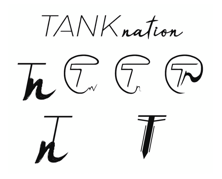
- Redesign the original logo. The old logo was tacky, and looked like something that was thrown together on MS Word. The clients also wanted to change the name from “time2” to “TankNation” using a logo that was dynamic, fresh, and youthful – just like their skincare products.
RESULTS
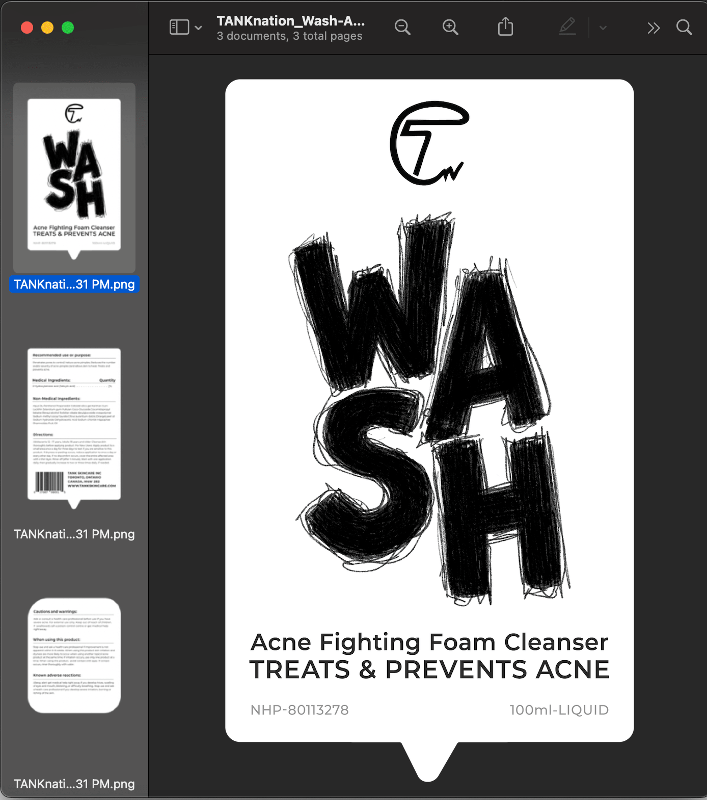
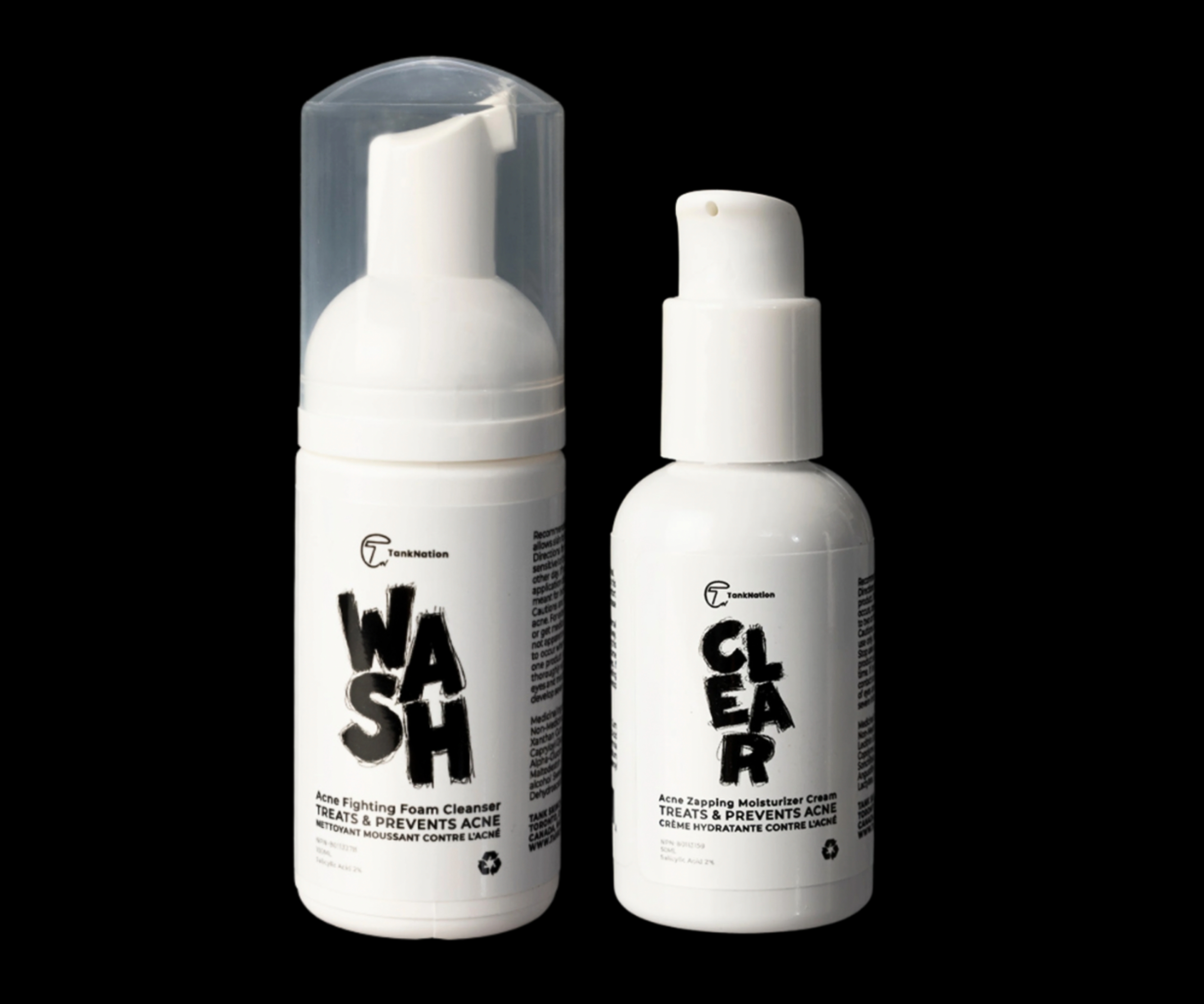
- Hand-drawn, rugged-looking product labels are more likely to catch the eyes of a teenage boy – and the simple design + packaging aids in this.
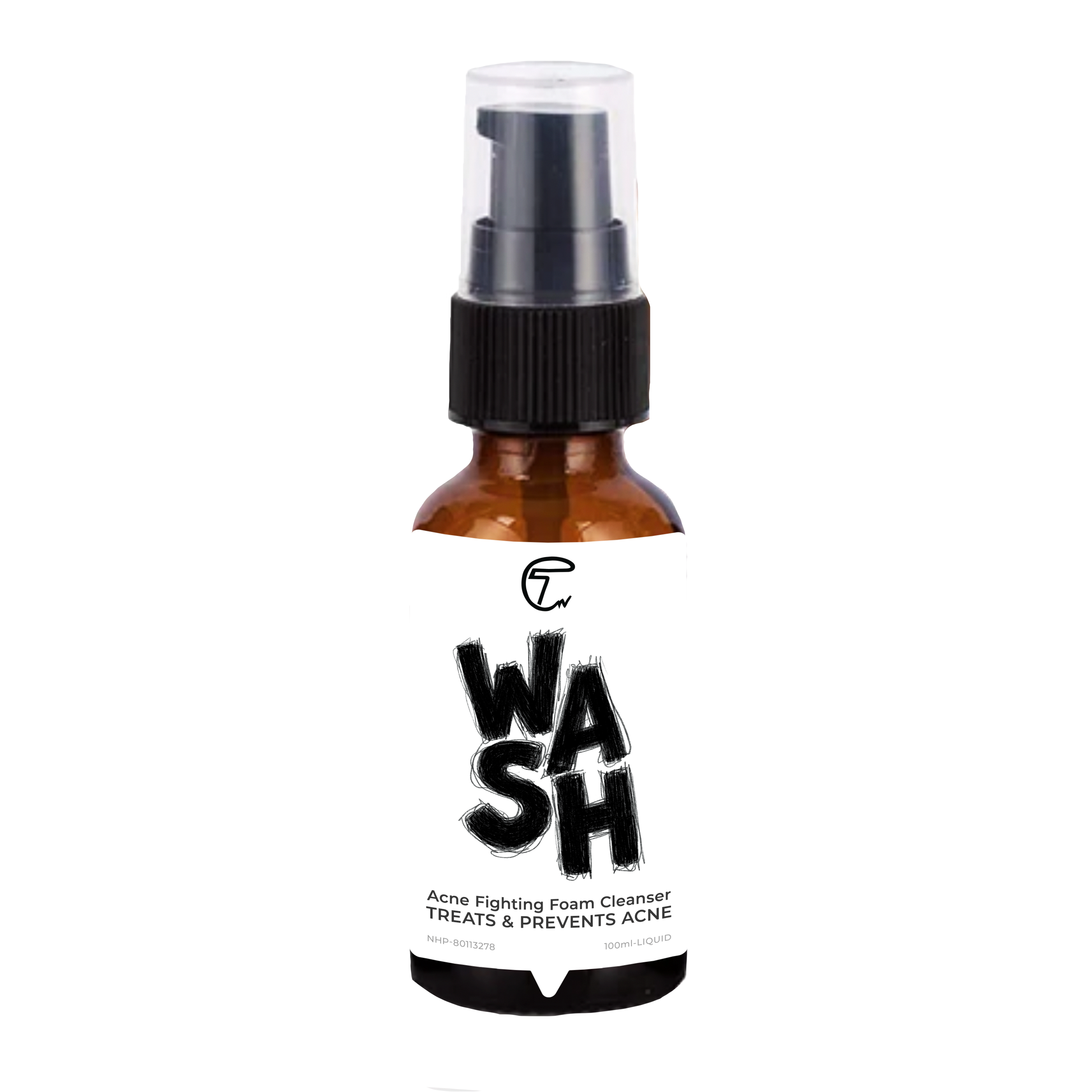
- Switching to all-white product packaging to be more eye-catching to the consumer when placed on grocery store/drug store shelves led to a 25% increase in sales.
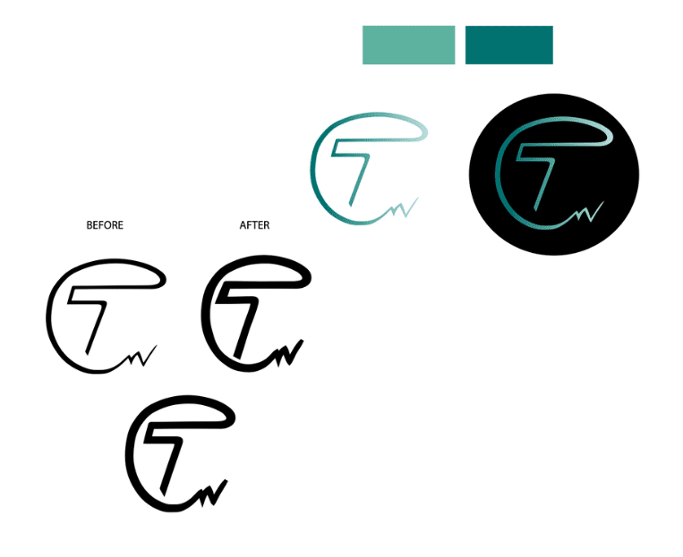
- Re-designing the logo using a combination of hand-drawn elements + mechanical/geometric fonts to represent brand values/image.
KEY INSIGHTS
- The target consumer (i.e.: teenage boys) are one of the easiest, yet simultaneously hardest to sell to – due to competitor skincare products + the fact that most young boys don’t show much interest in using skincare. Their main priorities usually include things like video games, sports, and hanging out with their friends. Therefore, the product’s design needed to be very simple (completely free of any excess embellishments or illustrations), while also being bold and attention-grabbing.
- As part of our initial social media ad campaign to launch this product, we focused on teenage boys who enjoy playing sports and may also suffer from acne due to the sweat & bacteria that accumulate from being athletic regularly.
(DISCLAIMER: Product photography completed by third party.)
Project Services: project management, visual design, digital + analog illustration, experimental typography, layout design
Completed For: TankNation Skincare
