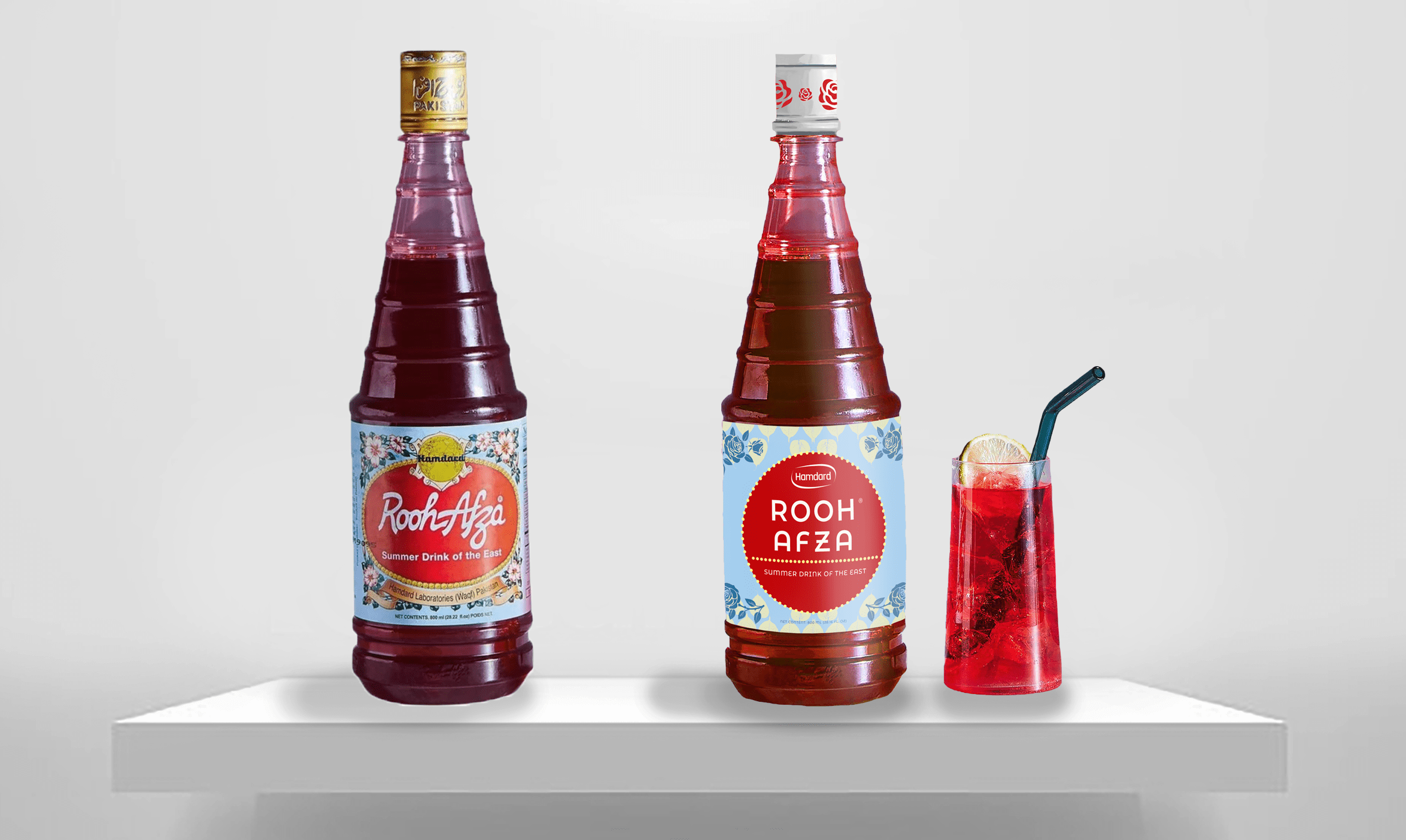


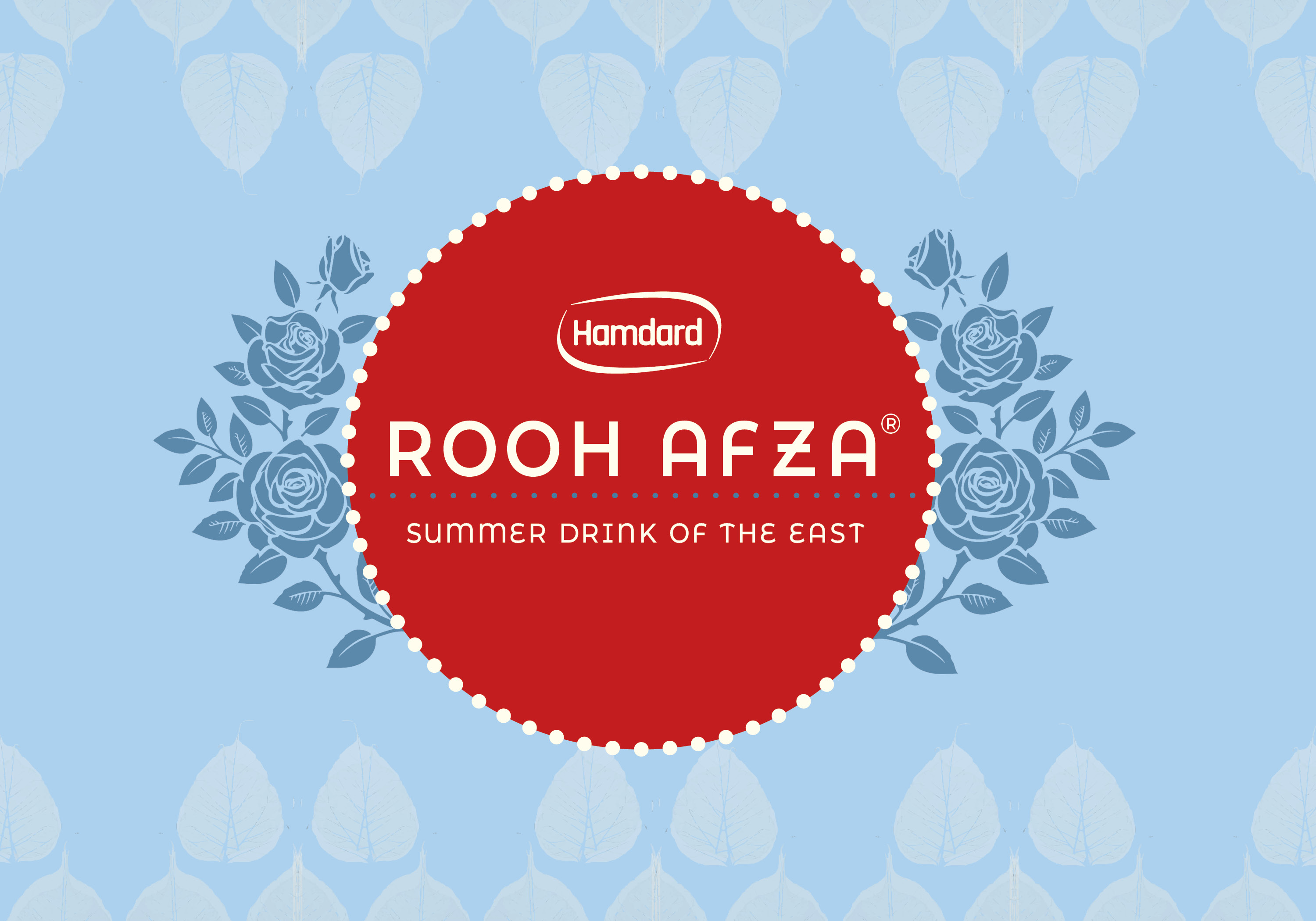

PROBLEM
An outdated, barely legible label with inconsistencies in fonts, typefaces, and colour palette.
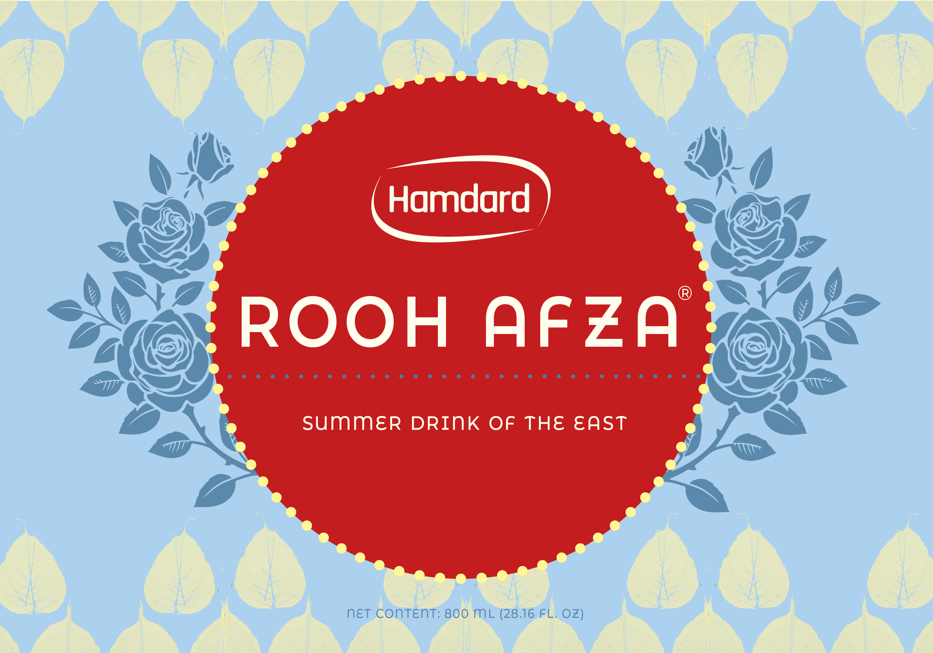
SOLUTION
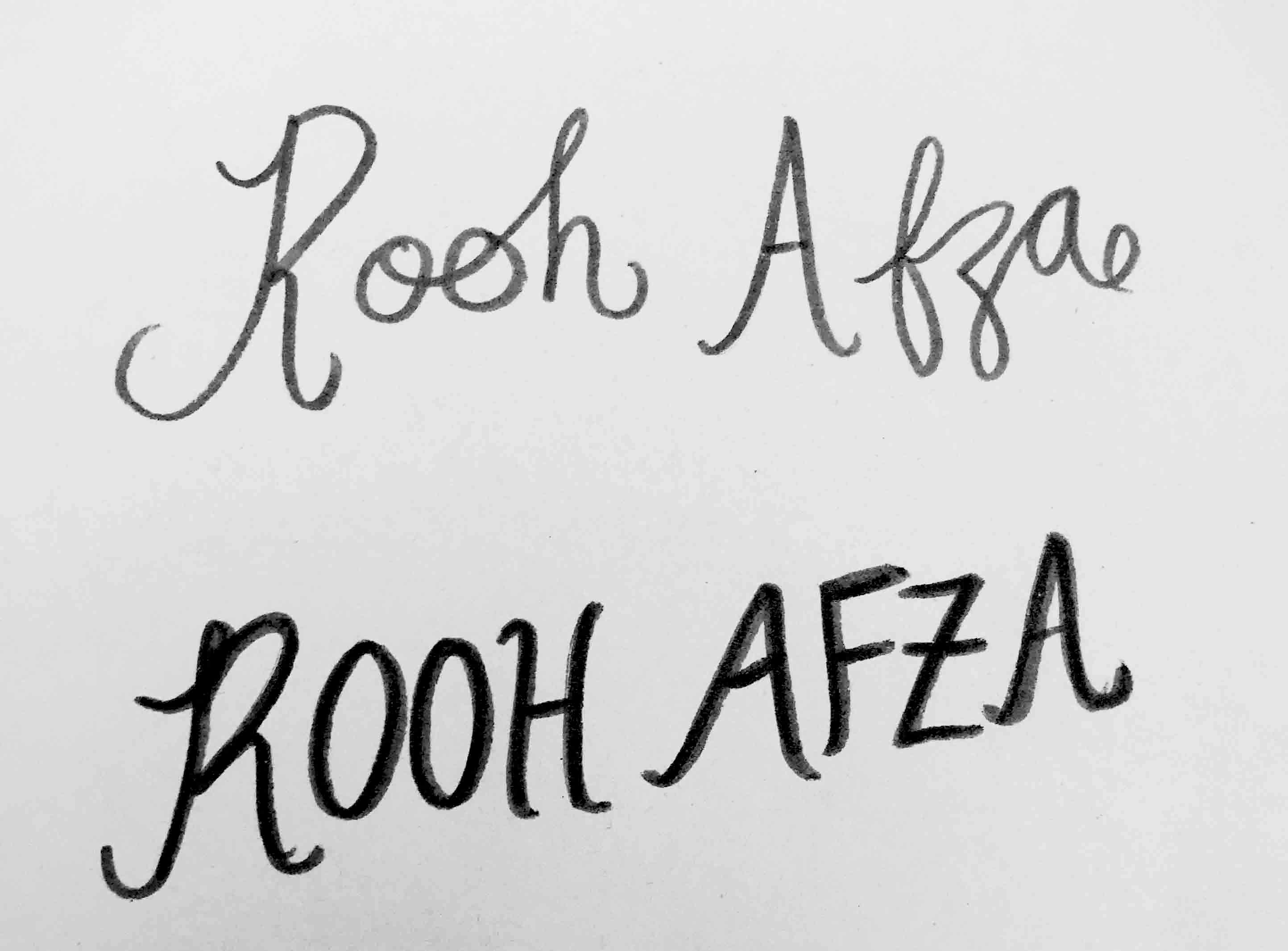
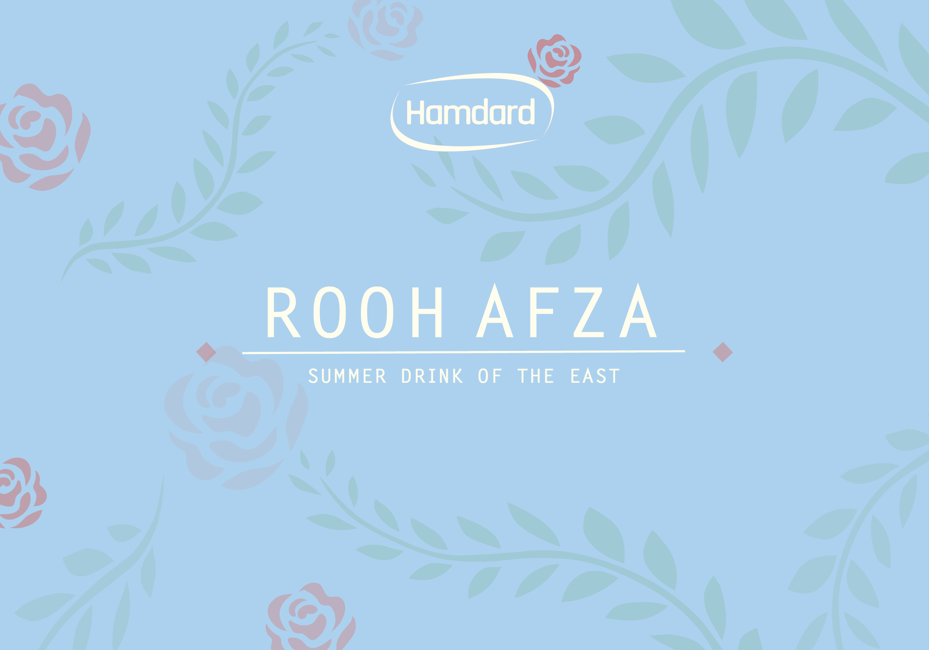
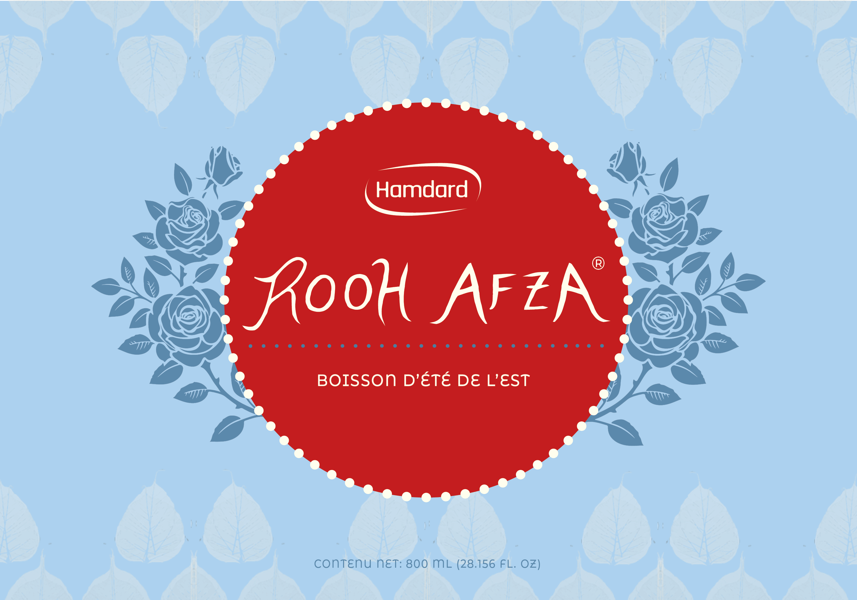
A strategic re-design to modify the existing label to be legible and visually cohesive without losing any of its brand equities. Narrow down the colour palette to just four colors – all complementary to one another to create consistency throughout the design. And for the title, replace the old hand-written script font with a modern, yet contemporary font.
KEY INSIGHTS
Since this product (Rooh Afza) is over a century old, it already has an existing loyal customer base, thus making it essential to maintain certain brand equities such as the bright red circle, the light blue background, the floral illustrations, etc. No drastic changes can be made. The label still needs to be easily identifiable and recognizable by returning customers.
Project Type: Conceptual (Case Study)
Project Duration: 4 Weeks
Project Scope: visual design, brand identity development, digital + analog illustration, concept development
Completed For: OCAD University
