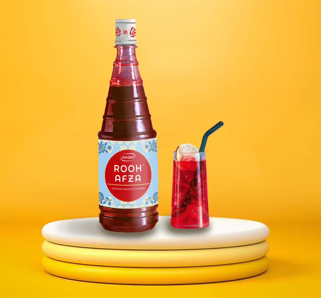
The end goal with this re-design was to modify the existing label to create one that was legible and contemporary in appearance. Since this product (Rooh Afza) is over a century old, it already has an existing loyal customer base, thus making it essential to maintain certain brand equities (i.e.: the red circle, the blue background, the floral illustrations). The original design utilizes a variety of fonts; distracting shapes; an inconsistent colour palette; and typography that is too condensed – making it hard to read.
My strategic re-design narrows down the colour options to just four colours – all of which are complementary to one another in order to create cohesiveness within the design. I also chose to use a different, more modern font that’s more legible but still has a bit of personality to it.
SCOPE OF WORK:
concept development
product photography
photo editing
illustration
typography