


Mad Housers: Strategic Re-branding Project
Mad Housers is a nonprofit focusing on providing shelter for the homeless as well as developing affordable housing for low-income individuals and houseless families. The organization’s employees are also passionate advocates for the homeless in order to ensure the protection of their moral & civil rights. The corporation also engages in research & education regarding issues of poverty & homelessness within Atlanta and surrounding regions.
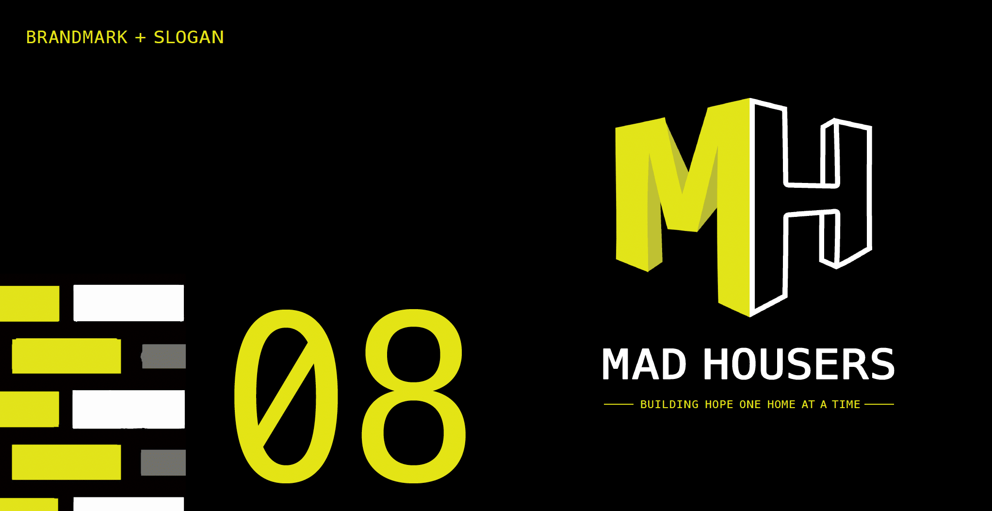
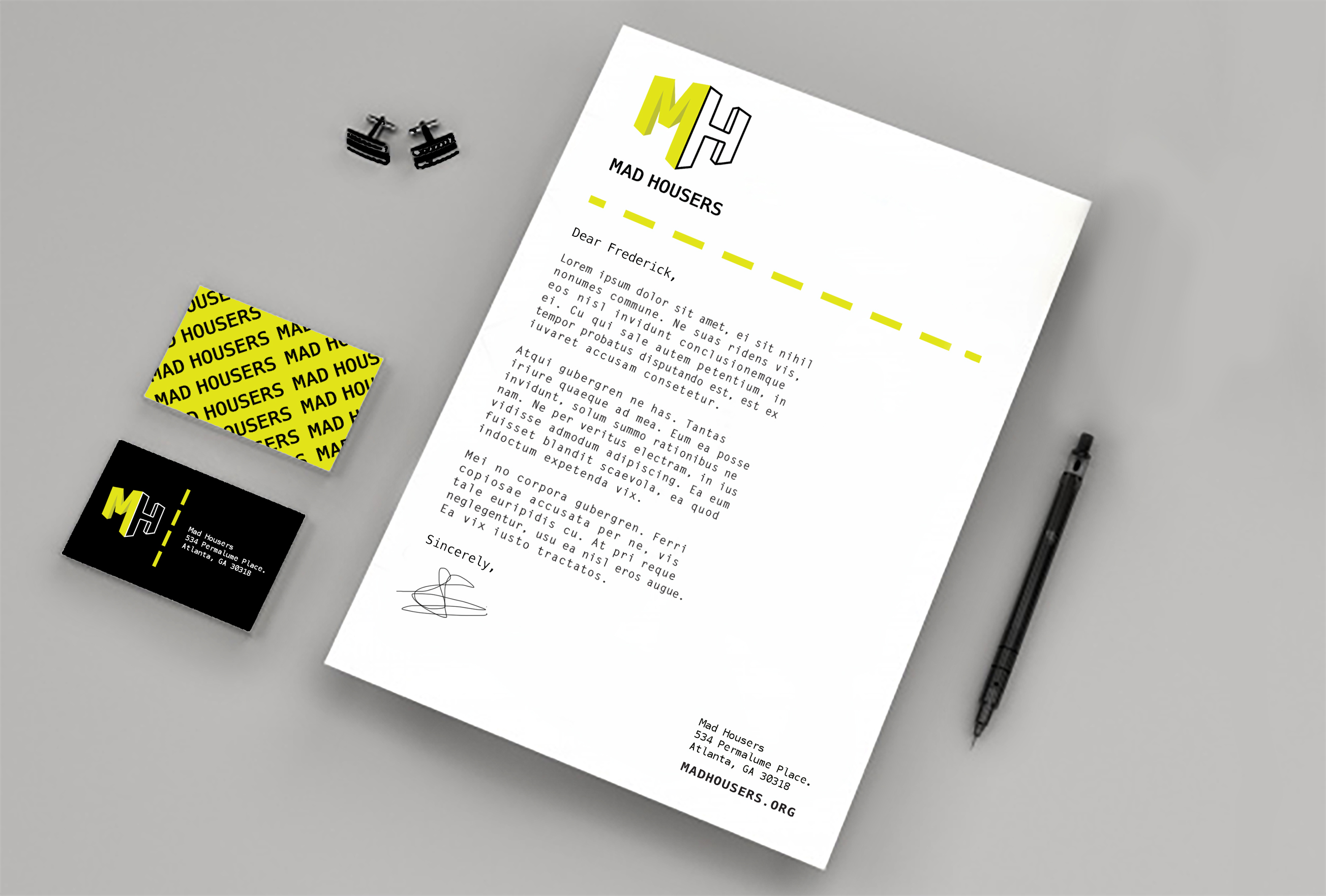
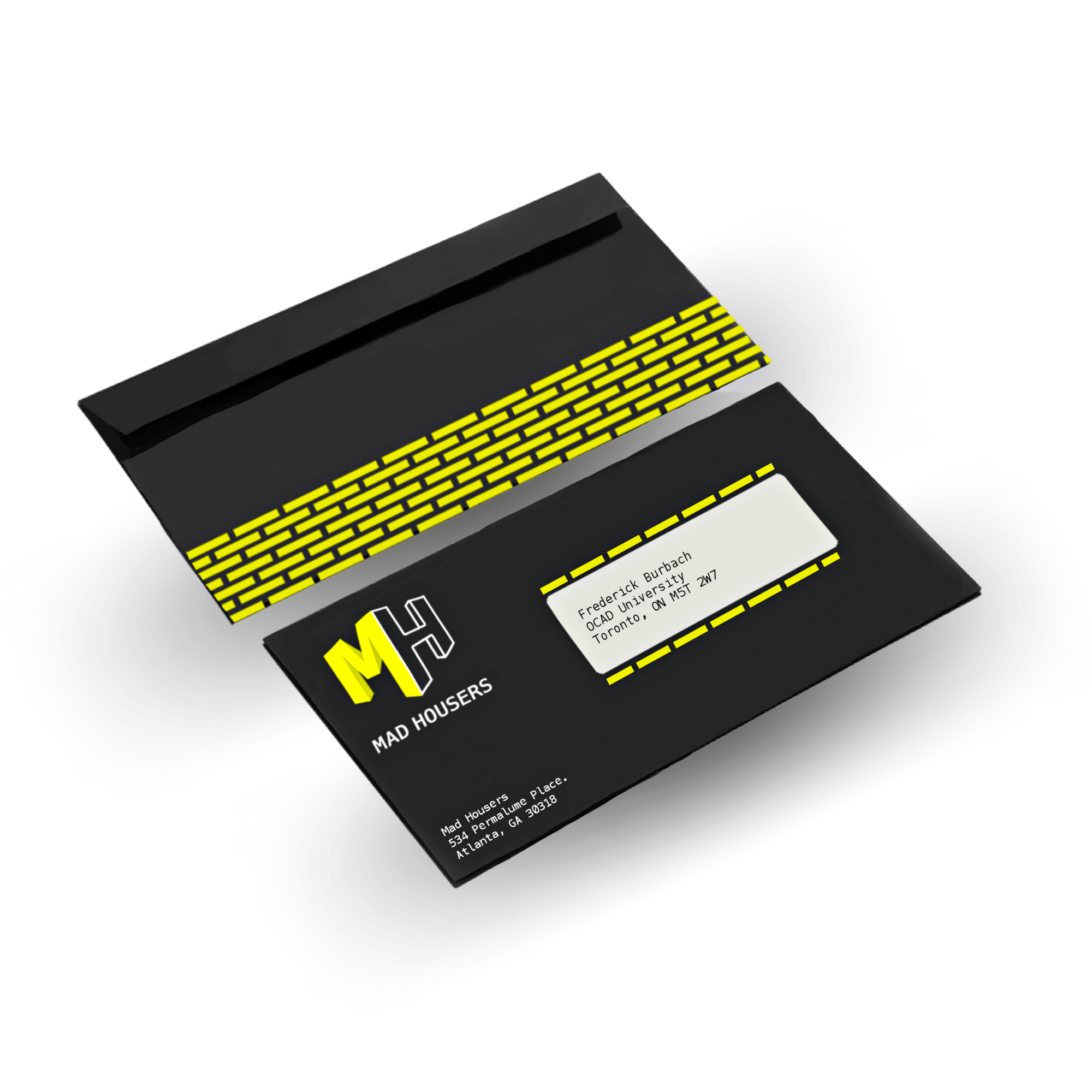
The organization’s current website is very outdated, as is its brandmark. Mad Housers’ original chosen colour palette is purple & grey – which communicates a dreary, uninspired message uninspired by their values. In my re-design, I have modified the colour palette from its existing purple/grey colour scheme to neon yellow & black to communicate a sense of urgency (i.e.: “Mad” Housers); high visual contrast; and an overall youthful vibe. Every creative decision was inspired by the fact that the organization Mad Housers is driven by young, compassionate, energetic folk who share a strong sense of community and innovation. With regards to the re-design of the existing brandmark, I’ve experimented with various graphic elements and designed products so as to expand beyond the underwhelming, easily ignored brandmark currently being used by the Mad Housers (as shown in the screenshot above). Another decision was to drop “The” from the name, since just “Mad Housers” has a better flow to it.
