


PROBLEM
To design a bottle and accompanying label that encapsulates the sensual, smoky flavours of the Canadian gin in a modern, yet classic way.
SOLUTION
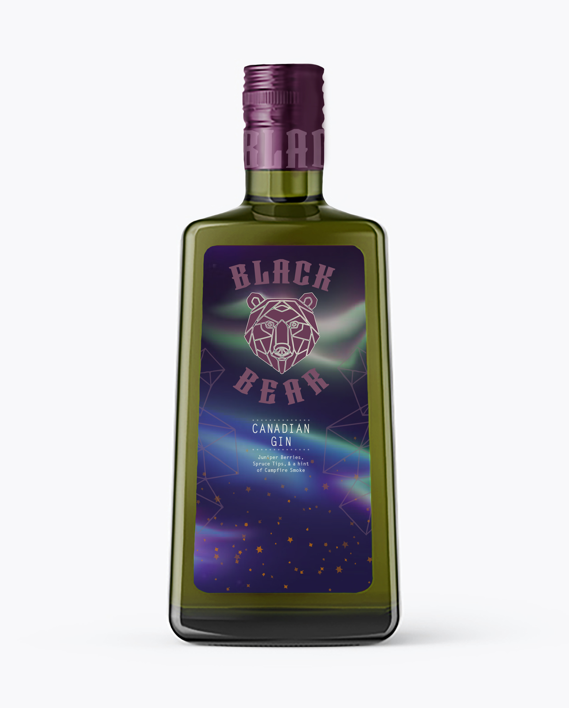
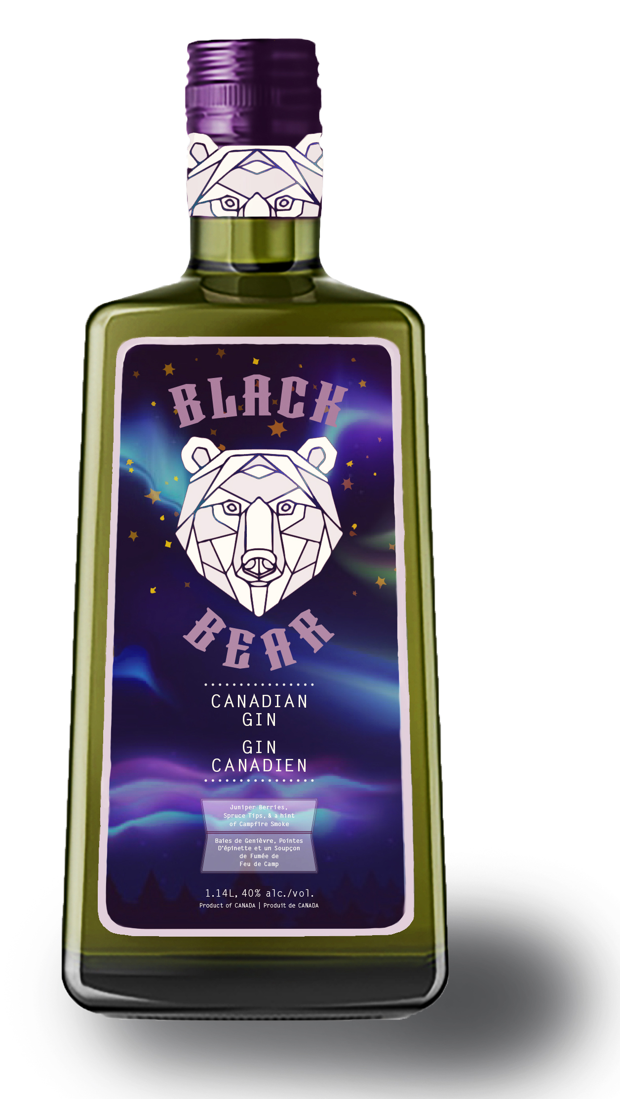
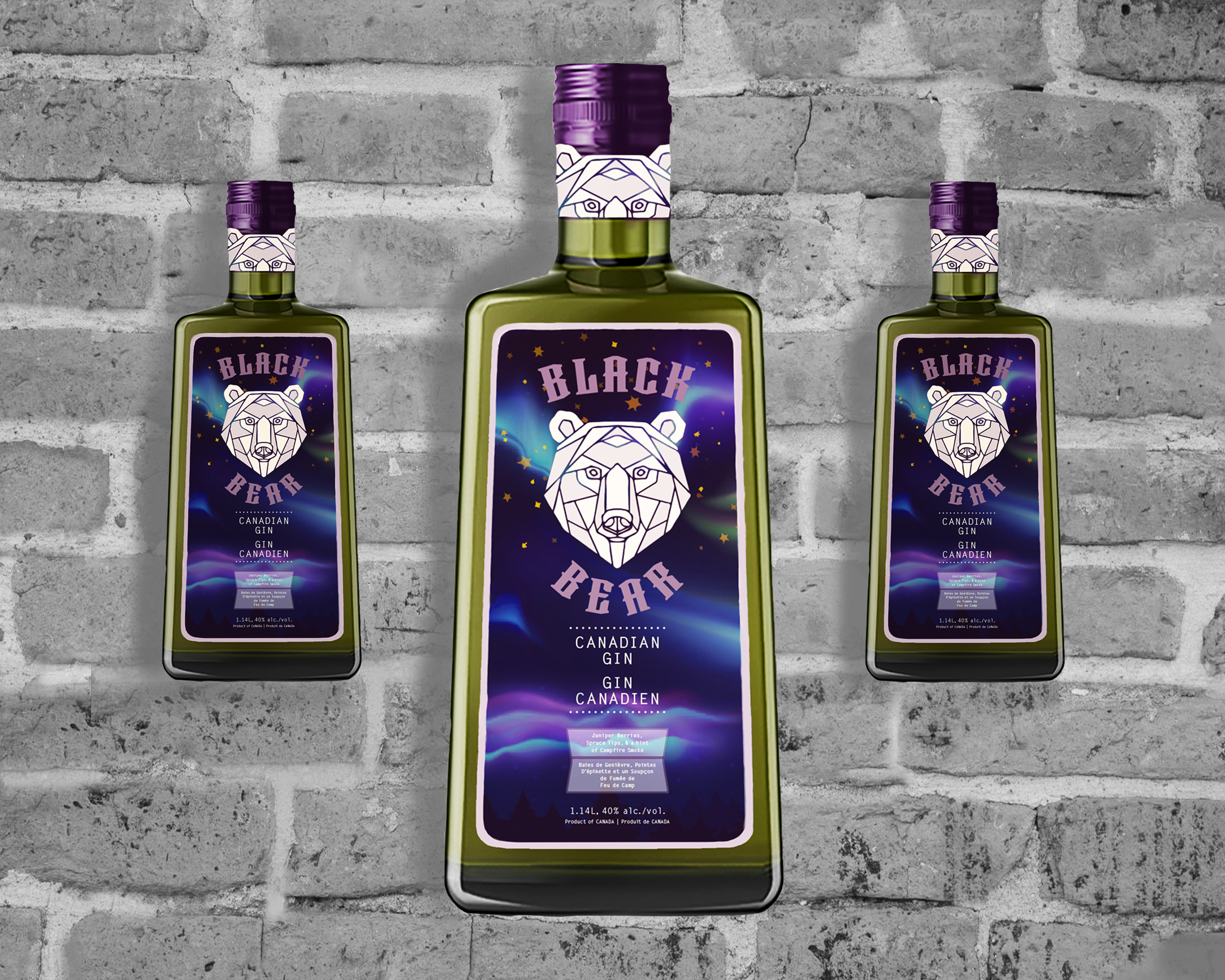
- The fruity/smoky flavours of the gin are represented via the chosen colour palette: juniper berry purple, fiery orange, spruce green, purple-grey, and creamy white. These are placed on top of a dreamy Northern Lights landscape to represent their Canadian origin. The orange stars (symbolizing the ‘smokey campfire’ flavour characteristic of the Gin) blend into the night sky while also adding a pop of colour.
- Competitor bottles of gin are usually round and either white or blue in colour. I wanted this bottle to stand out on the shelves so I chose a unique shape and colour – both of which compliment my overarching design theme.
KEY INSIGHTS
- Making sure to stay true to Bacardi’s brand values and brand essence posed a bit of a challenge while trying to be unique. This was attained through extensive research into Bacardi’s other products and in-store products as seen on LCBO’s shelves.
Project Type: Conceptual Project
Project Duration: 4 Weeks
Project Scope: project management, visual design, 2d mockups, digital + analog illustration, concept development, layout design, label design, bottle design
Completed For: Bacardi Gin
